Identity design and revision for promotional products start-up
It’s great when you have a strong working relationship with a client and get the chance to revisit a brand. The chance to view it with fresh eyes and a new perspective allows you to make huge improvements.
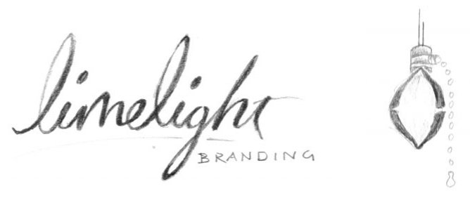
The original concept was to break the mold and create an identity that would stand out dramatically in the sea of promotional products companies. The final version was an energetic, curved, hand-drawn script.
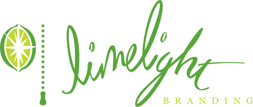
The revised version is much more grown up and has the confidence to know that it doesn’t have to be wild and crazy to command attention. Significant updates to the lettering in the re-draw keep this brand fun and dynamic, while grounding and strengthening it.